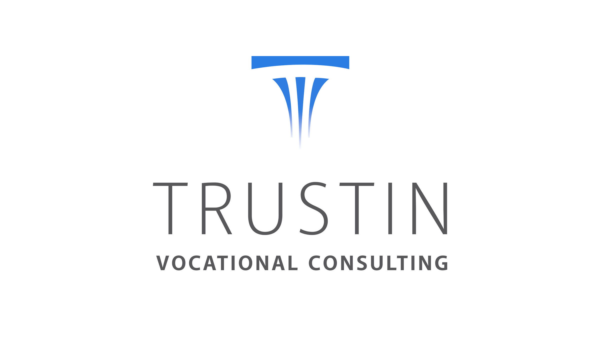
Trustin Vocational Consulting provides vocational evaluations, testimony and written employment plans for family law attorneys. Their mark needed to be associated with the law industry, while positioning itself as elegant and simple. I always begin every job with rough pencil sketches. This allows complete freedom to think laterally and get the “mistakes” out of the way. After we arrive at a few that we like, I then scan those sketches and begin refining one or two. I arrived at a stylized “T” that also suggests a vertical column. A simple sans serif font was used with extra tracking, allowing for maximum legibility and simplicity.
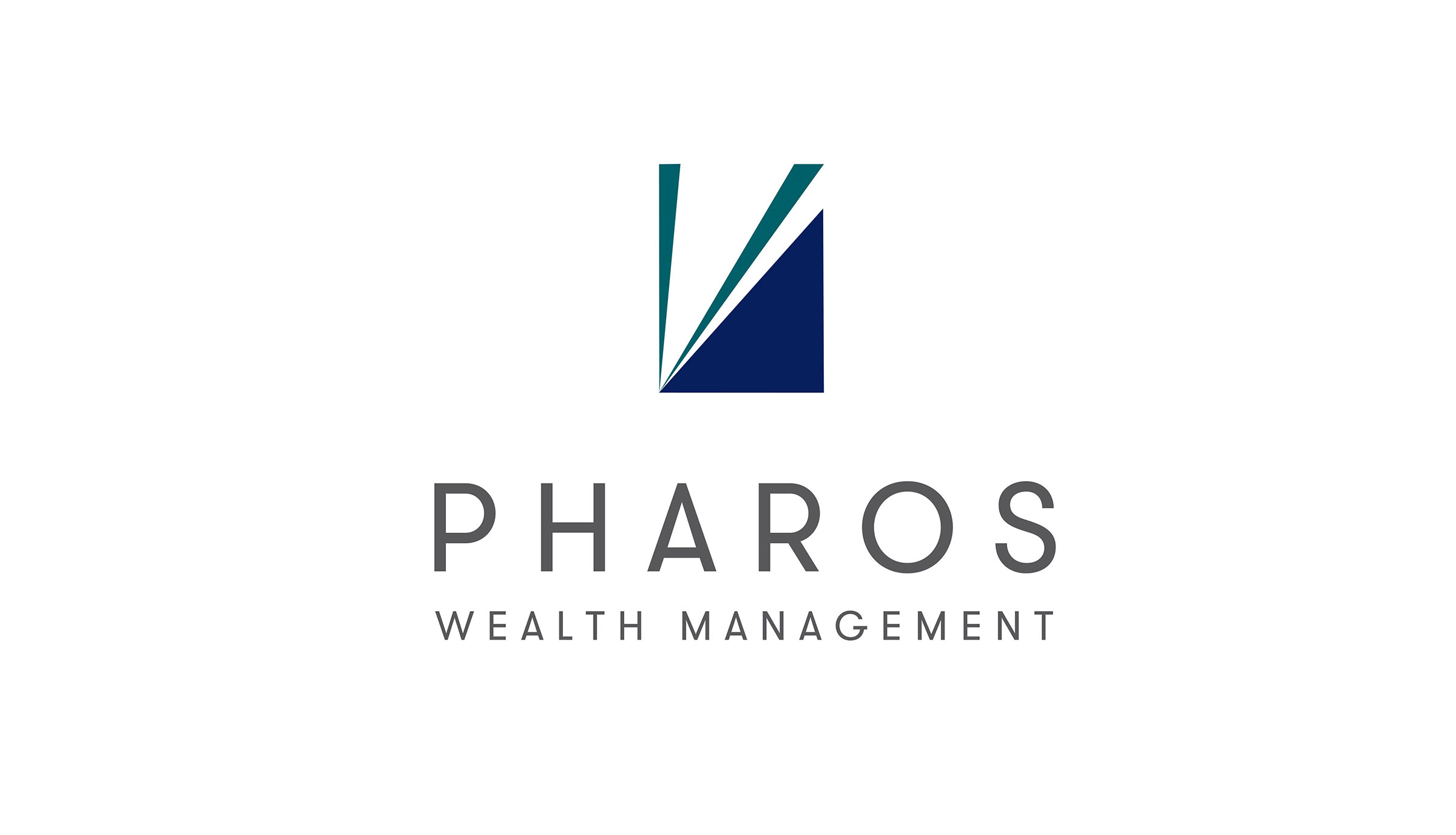
Pharos Wealth Management is a financial services firm founded on principals that are focused on helping clients pursue and achieve their financial goals. The term “Pharos” describes a guiding light. The firm was formed because of a realization that real people need practical help to navigate the seemingly confusing, opaque world of investment. Pharos is your guiding light.
I began by examining “light”—not often-used lighthouses, but rather the beam that forms the light. We wanted a dynamic feel and a mark that would easily translate on any device. Our font has an open, friendly feel and is rendered in a charcoal grey; this helps to compliment the two-color mark. Once again, Gestalt principles are at work, with the negative space forming the beam of light.
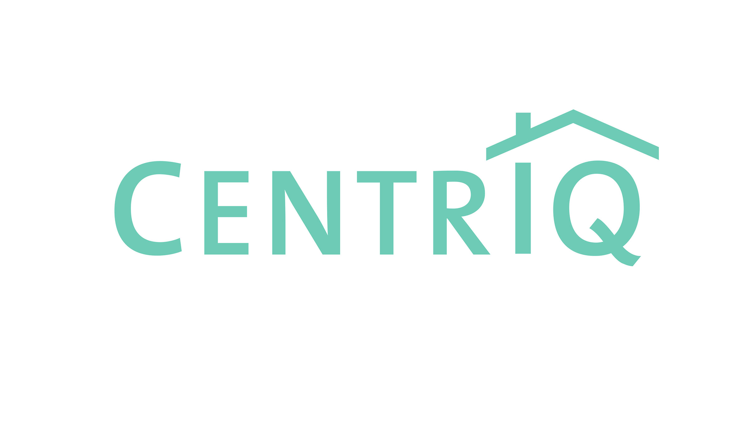
CentrIQ is a mobile technology platform providing an easier way to operate and maintain your home and everything in it from the palm of your hand. The CentrIQ app provides a much easier and efficient way to manage the information attached to anything in your home—the appliances, the equipment, the paint—or even reminding you when to water particular plants in the garden!
We began the development of this brand with a G+K Brand RoadMap, which determined the core values, brand message, brand personality and finally the iconography. The focus became the “IQ” portion of the name—a smarter way to monitor everything associated with your home. I placed a roof graphic over the “IQ” in the logo to help draw the eye there. Adding a chimney as part of the lower case “i” helped to integrate both elements.
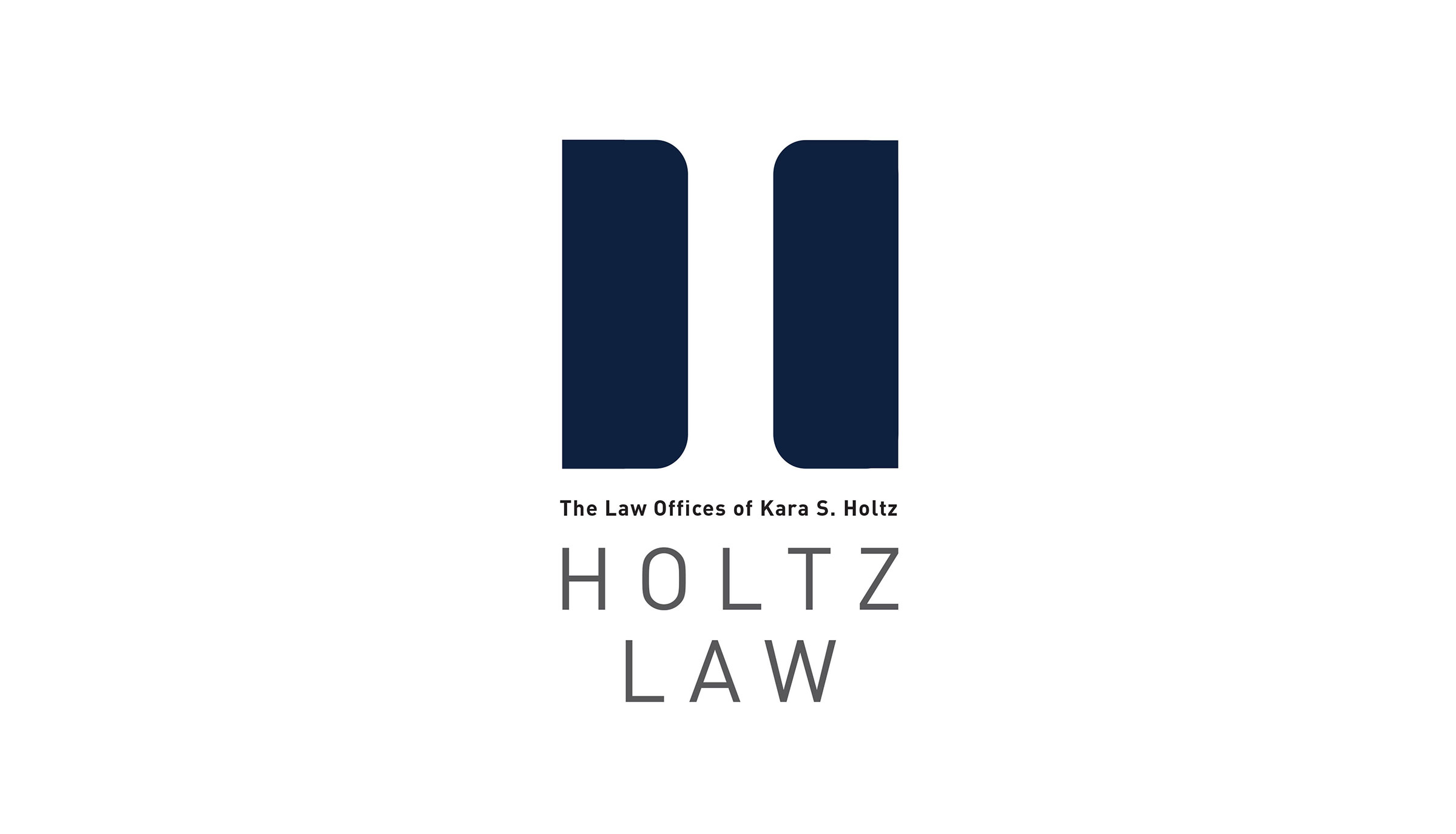
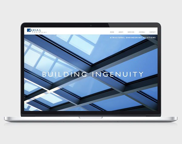
A family law practice with two locations serving the SF Bay Area. During development of our Brand RoadMap, we identified three Core Values that defined Holtz Law—Trust, Commitment and Professionalism. Their new brand identity needed to convey these values in a simple, contemporary manner.
The two basic shapes represent a coming together to achieve constructive change, while simultaneously creating a pillar in the negative space between. Closure is a Gestalt design technique that uses the human eye’s tendency to see closed shapes. Closure works where an object is incomplete or the interior space of an element is not fully closed, but the viewer perceives a complete shape by filling in the missing information.
The font is clean and contemporary, positioning the firm for the future.
Gourmet Food & Wine Tours is the first walking food-and-wine pairing tour company featuring the most charming parts of Sonoma, Napa (Yountville), Sausalito and Tiburon, celebrating some of the finest restaurants in California Wine Country.
Their logo needed to express the joy in discovering gourmet food and wine in an artistic, whimsical yet elegant manner. The font for the logo was designed by Herman Zapf and helps to position the organization apart from their competitors.
MHC+B is a professional organization handling detailed bookkeeping while not losing sight of the big picture. And they are not just bookkeepers. Rather, they are partners who share an interest in the long-range financial health of their client’s business.
The MH CONSULTING + BOOKKEEPING logo is specifically designed to accommodate any media. I began by exploring a variety of shapes with the focus on “MH”, finally arriving at a mathematical equation feel coupled with a checkmark. The checkmark is universal and conveys that something is “correct, or dealt with”. I then integrated that to become part of the “M”.
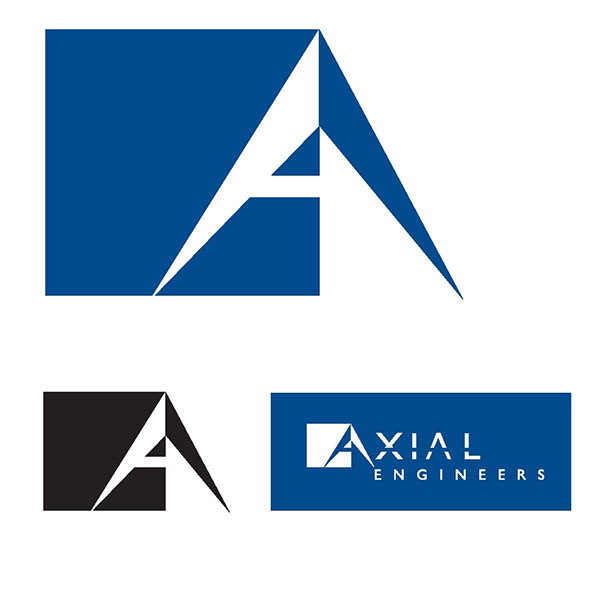
L Bailey Search is a contingency search firm that works with the rigor of a retained search firm. To make the best match, they interview the top prospects to determine the right fit and find the ideal candidate for specific job openings. They also put a strong emphasis on the career aspirations of the top candidates to be sure they are aligned with the position.
The starting point for this mark was the concept of “search and find”. What makes a candidate for a specific employment opportunity unique? Through their proprietary methodologies, L Bailey Search is able to identify not just a group of candidates, but more candidates that are relevant. Feeling that human forms were over-used in this category, we instead opted for an abstraction. The finished mark symbolizes the uniqueness of individuals and the action of finding a specific person.
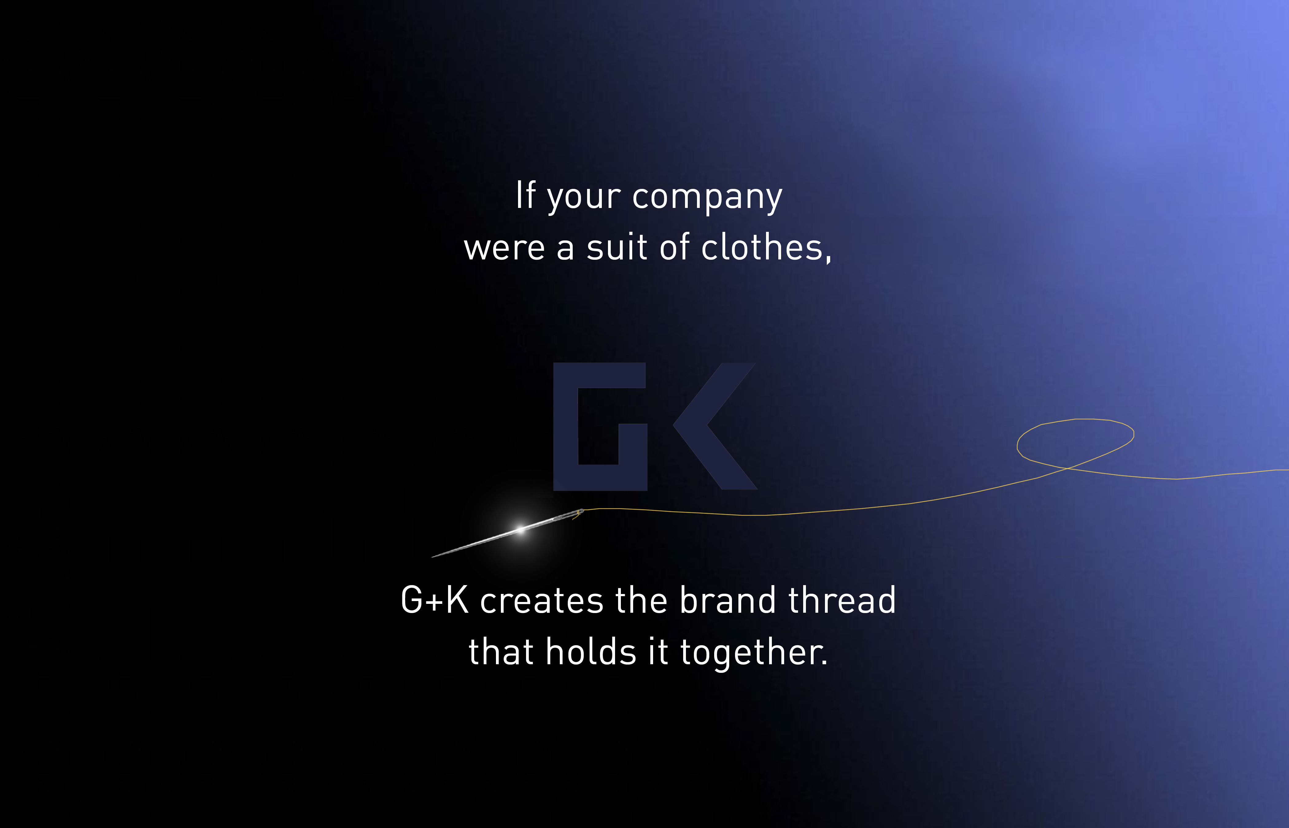
What’s a logo, exactly?
Brand is much more than a name or a logo. When it comes to an organization, brand is everything and everything is brand. It’s about caring about your business at every level. And following through on—and effectively communicating your company’s promise.
A logo is just a shorthand way for people to know who’s talking to them. An eye-catching, memorable logo helps people find your product or service among thousands of other products or services. It’s important that clients understand what their logo is communicating, both as a symbol in isolation—for new customers—and as a consistent image of their brand for existing customers.
What constitutes a successful logo?
-Establishes immediate recognition for your company
-Expresses the company’s character and attitude
-Conveys the company is an expert or leader in its field
-Instills in the public a sense of trust
Although logo design is but a small segment of what G+K does, it is extremely important that organizations understand the importance of branding in general, and that a company’s brand is a strategic asset that can be used to help position them against competition.
I will be posting some new projects soon—so stop back again.
-Tom